📚 목차
React를 위한 Storybook
Storybook이란?
Storybook은 UI 컴포넌트를 독립적으로 개발하고 테스트할 수 있는 도구이다.
Storybook을 사용하면 UI 컴포넌트를 Story 라는 단위로 관리할 수 있으며, 각 스토리는 특정 상태의 컴포넌트를 보여준다.
이를 통해 UI 컴포넌트를 쉽게 문서화하고, 테스트하고, 재사용할 수 있다.
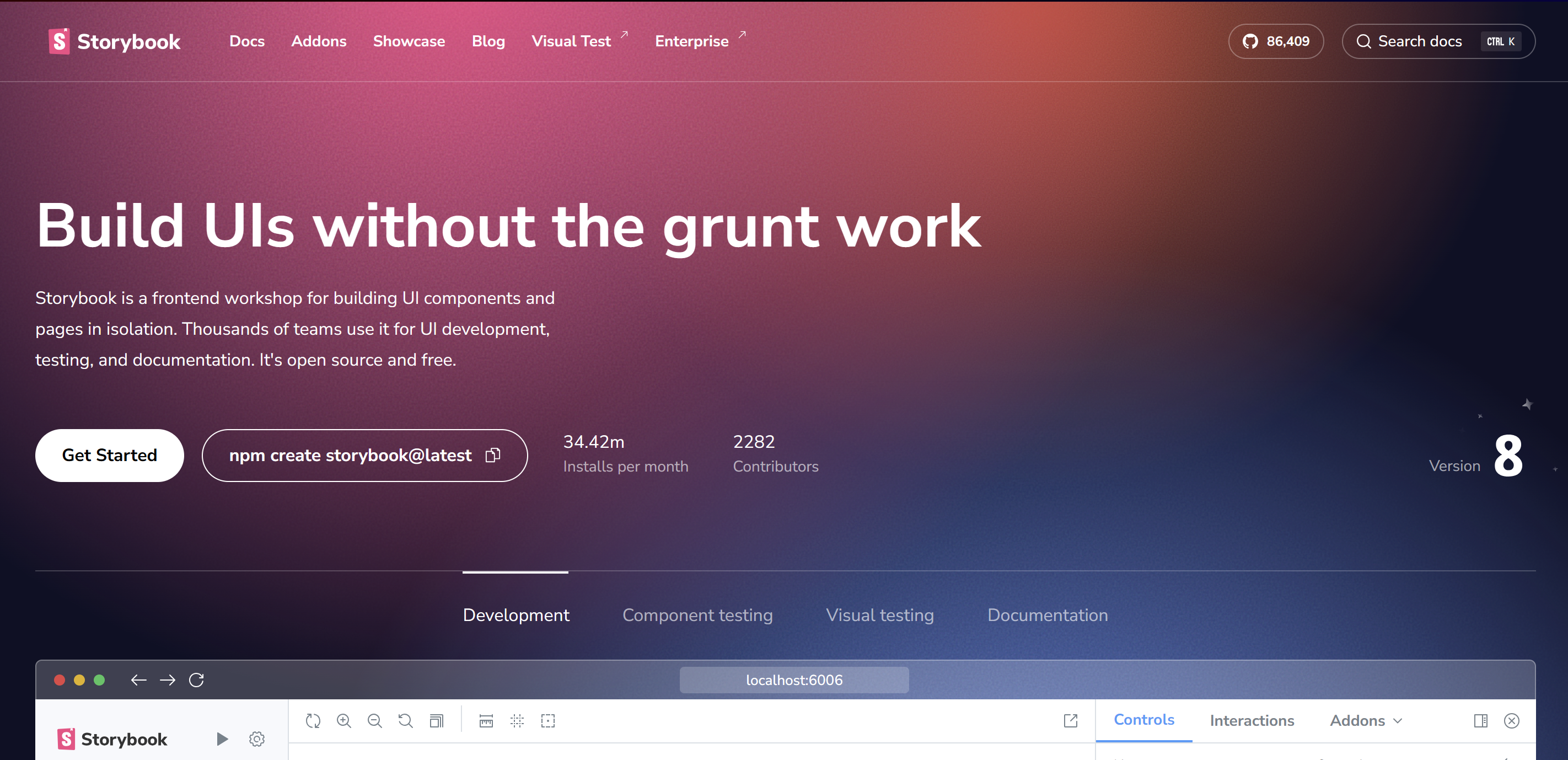
위와 같이 공식 문서에서 가장 눈에 먼저 띄는 문장은 'Build UIs without the grunt work'이다.
번역을 해보면 '잡일(귀찮은 일) 없이 UI를 구축하라'는 뜻이다.
과연 이게 무엇을 의미하는 것일까?
우리가 쉽게 떠올릴 수 있는 grunt work는 많은 컴포넌트 중에서 하나를 선택하고, 그 컴포넌트를 사용하기 위해서 필요한 props를 확인하고, 그 props에 맞는 값을 넣어주고, 그 컴포넌트를 렌더링하는 것이다.
이런 작업을 반복하다 보면, 컴포넌트를 사용하기 위한 준비 작업에 많은 시간을 소모하게 된다.
Storybook은 이러한 준비 작업을 줄여주고, UI 컴포넌트를 독립적으로 개발하고 테스트할 수 있는 환경을 제공한다.
이러한 환경을 제공함으로써, UI 컴포넌트를 개발하는 데 집중할 수 있게 해준다.
Storybook is a frontend workshop for building UI components and pages in isolation. Thousands of teams use it for UI development, testing, and documentation. It's open source and free.
이 문장은 어떤 의미를 가질까?
isolation 이라는 단어를 생각해봐야한다.
즉, Storybook은 UI 컴포넌트를 고립된 상태에서 개발할 수 있는 환경을 제공한다는 것이다.
이러한 환경을 제공함으로써, UI 컴포넌트를 개발하는 데 집중할 수 있게 해준다.
또한, 왜 workshop라는 단어를 사용했을까?
프론트엔드 개발자 뿐만 아니라 디자이너, QA 엔지니어 등 다양한 직군의 사람들과 함께 Storybook를 통하여 협업할 수 있다는 것이다.
Develop durable user interfaces, Storybook provides a workshop to build UIs in isolation. It helps you develop hard-to-reach states and edge cases without needing to run the whole app.
마지막으로 Storybook 공식 문서에서 위와 같이 설명하고 있다.
hard-to-reach states and edge cases는 무엇을 의미할까?
규모가 큰 애플리케이션을 개발하다 보면, 특정 컴포넌트를 테스트하기 위해서 애플리케이션의 특정 상태로 만들어야 하는 경우가 있다.
즉, 특정 컴포넌트를 테스트하기 위해서 애플리케이션의 상태를 변경해야 하는 경우가 있다.
이런 경우에 Storybook을 사용하면, 애플리케이션의 상태를 변경하지 않고도 특정 컴포넌트를 테스트할 수 있다.
이러한 점에서 Storybook은 UI 컴포넌트를 개발하는 데 매우 유용한 도구이다.
결과적으로, 우리는 storybook을 통하여 durable 한 UI를 개발할 수 있다.
Storybook 개념 및 사용 방법
Story란?
Story는 UI 컴포넌트의 특정 상태를 나타내는 단위이다.
각 스토리는 컴포넌트를 렌더링하는 데 필요한 props를 설정하고, 그 props에 맞는 값을 넣어준다.
아래 코드에서 Button UI 컴포넌트를 Storybook을 통해 테스트코드를 작성해보자.
Button UI 컴포넌트 - Button.tsx
// src/components/Button.tsx
import React from 'react';

type ButtonProps = {
  label: string;
  onClick?: () => void;
};

const Button: React.FC<ButtonProps> = ({ label, onClick }) => {
  return (
    <button
      onClick={onClick}
      style={{
        padding: '8px 16px',
        background: '#007bff',
        color: '#fff',
        border: 'none',
        borderRadius: '4px',
      }}
    >
      {label}
    </button>
  );
};

export default Button;
Storybook - Button.stories.ts
import React from 'react';
import { Meta, StoryObj } from '@storybook/react';
import Button from './Button';

const meta: Meta<typeof Button> = {
  title: 'Components/Button',
  component: Button,
  tags: ['autodocs'],
  argTypes: {
    label: { control: 'text', description: '버튼에 표시될 텍스트' },
    onClick: { action: 'clicked', description: '버튼 클릭 시 실행될 함수' },
    color: { control: 'color', description: '버튼 배경색' },
  },
};

export default meta;
type Story = StoryObj<typeof Button>;

export const Primary: Story = {
  args: {
    label: 'Click Me!',
    color: '#007bff',
  },
};

export const WithAction: Story = {
  args: {
    label: 'Say Hello',
    color: '#28a745',
  },
};
Storybook 코드를 하나씩 살펴보자.
-
import { Meta, StoryObj } from '@storybook/react';
→ Storybook에서 제공하는 컴포넌트 메타정보 타입(Meta) 과 스토리 객체 타입(StoryObj) 를 import 한다. -
const meta: Meta<typeof Button> = {...}
→ Button 컴포넌트에 대한 Storybook 메타데이터를 설정한다. 제목(title), 사용할 컴포넌트(component) 등을 정의한다. -
argTypes: { ... }
→ 각 prop의 제어 방식과 설명을 정의한다. Controls 패널에서 사용자가 값들을 직접 조작할 수 있도록 도와준다. -
export default meta;
→ 설정한 메타데이터를 기본 내보내기(export)로 공개하여 Storybook에서 인식하게 한다. -
type Story = StoryObj<typeof Button>;
→ Button 컴포넌트를 사용하는 스토리의 타입을 정의한다. -
export const Primary: Story = {...}
→ Primary라는 스토리를 정의하고 args로 초기 prop 값을 전달한다. Controls에서 쉽게 값 변경 가능. -
export const WithAction: Story = {...}
→ WithAction 스토리는 alert 없이 Controls 패널과 action logger로 클릭 이벤트 확인이 가능하다 (이벤트는 argTypes에서 설정함).
render 함수
render는 스토리를 어떻게 렌더링할지 정의하는 함수이다.
기본적으로 Storybook은 내부적으로 render(args) => <Component {...args} /> 구조를 사용한다.
하지만 직접 render 함수를 작성하면 더 복잡한 로직도 포함시킬 수 있다. (예: useState 등 React 훅 사용)
args는 스토리북에 전달할 props의 초기값이다. 스토리를 어떤 기본 상태로 보여줄지 설정한다.
Controls 패널에서 실시간으로 수정할 수 있다.
기본적인 render + args 예제
import React from 'react';
import type { Meta, StoryObj } from '@storybook/react';
import Button from './Button';

const meta: Meta<typeof Button> = {
  title: 'Components/Button',
  component: Button,
  argTypes: {
    label: { control: 'text' },
    color: { control: 'color' },
    onClick: { action: 'clicked' },
  },
};

export default meta;
type Story = StoryObj<typeof Button>;

// 기본 버튼
export const Primary: Story = {
  render: (args) => <Button {...args} />,
  args: {
    label: 'Primary Button',
    color: '#007bff',
  },
};

// 위험 색상 버튼
export const Danger: Story = {
  render: (args) => <Button {...args} />,
  args: {
    label: 'Danger Button',
    color: '#dc3545',
  },
};
render에 React 로직 추가한 예제
// 클릭할 때마다 카운트 증가
export const WithClickCounter: Story = {
  render: (args) => {
    const [count, setCount] = React.useState(0);
    return (
      <Button
        {...args}
        label={`Clicked ${count} times`}
        onClick={() => setCount((prev) => prev + 1)}
      />
    );
  },
  args: {
    color: '#28a745',
  },
};

// 토글 버튼 예시
export const ConditionalLabel: Story = {
  render: (args) => {
    const [toggled, setToggled] = React.useState(false);
    return (
      <Button
        {...args}
        label={toggled ? 'On' : 'Off'}
        onClick={() => setToggled((prev) => !prev)}
      />
    );
  },
  args: {
    color: '#ffc107',
  },
};
이처럼 render 안에서는 useState, useEffect, 로직 분기 등을 자유롭게 쓸 수 있어 Storybook을 인터랙티브하게 만들 수 있다다
args 없이 직접 입력하는 컴포넌트 예시
import React, { useState } from 'react';
import type { Meta, StoryObj } from '@storybook/react';
import CustomInput from './CustomInput';

const meta: Meta<typeof CustomInput> = {
  title: 'Shared/CustomInput',
  component: CustomInput,
};

export default meta;
type Story = StoryObj<typeof CustomInput>;

export const InteractiveInput: Story = {
  render: () => {
    const [value, setValue] = useState('');
    return (
      <div style={{ width: '300px' }}>
        <CustomInput placeholder='직접 입력해보세요!' onChange={(e) => setValue(e.target.value)} />
        <p>현재 입력값: {value}</p>
      </div>
    );
  },
};
label, color, value 같은 값들이 내부 상태로 처리되고 사용자 입력으로 실시간 변경된다.